
Project Overview
Working with The Grid was a streamlined yet genuinely insightful experience. Entering an industry as established and competitive as tennis clubs raises one core question early on: how do you stand out when so many names are already in play?
The answer for The Grid wasn’t to compete on tradition alone, it was to redefine what an elite tennis club could feel like. Epic tennis, great company, and cocktails that hit just right. A club where performance and connection matters just as much as competition.
This project focused on building a premium, distinctive brand identity that felt bold, fun, and luxurious without blending into the sea of conventional tennis branding.
The Brand Challenge
Tennis clubs are often expected to set a high standard for their members. For The Grid, that standard wasn’t found solely in formality or exclusivity, but in experience.
They wanted:
- A premium brand feel without appearing stiff or traditional
- A look that was bold and confident, yet inviting
- A visual identity that reflected fun, trust, and connection
- Branding that made tennis feel social, modern, and enjoyable
Most importantly, The Grid understood that making tennis fun is what matters most — and that the connections formed through staying active often last far beyond the court.
Understanding The Grid’s Clientele
Before any design work began, it was essential to identify who The Grid was really for and how to fill their VIP members list.
The Grid’s audience isn’t limited to one type of player. Instead, it brings together people who value both sport and social connection:
- Fun, themed tennis games with your best friend
- Serious matches with your partner
- Long conversations, laughter, and cocktails after a good match
This blend of energy, elegance, and community became the foundation of the brand identity.
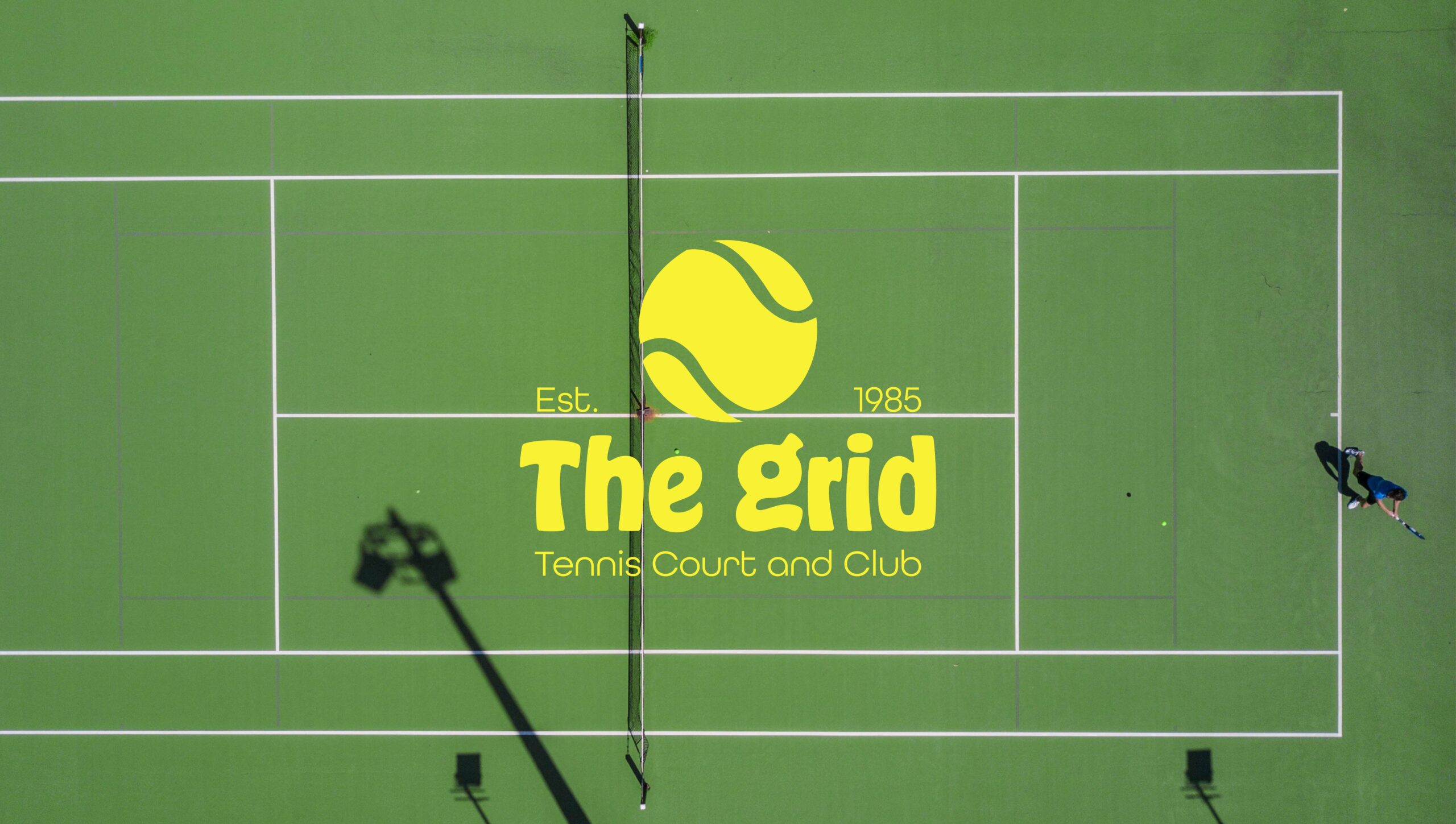
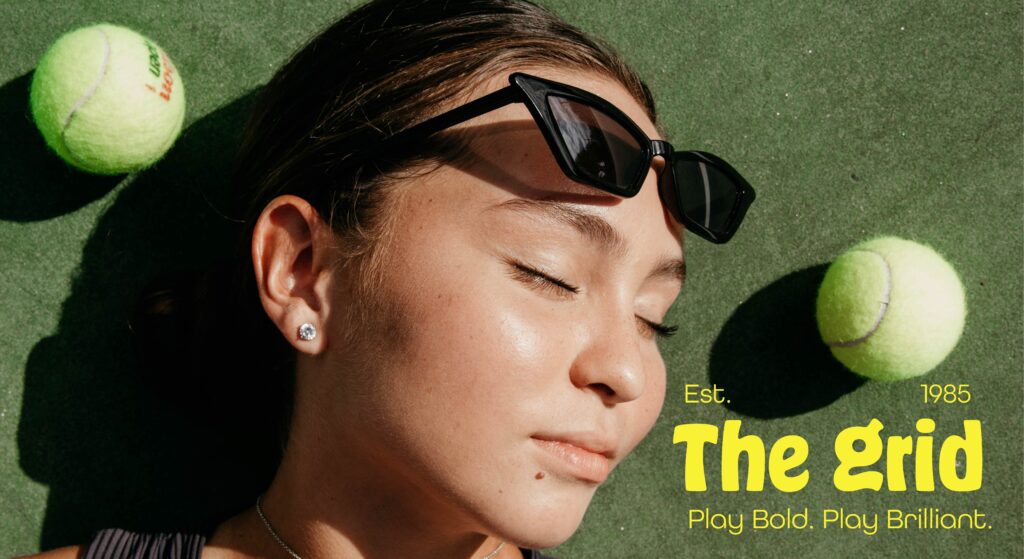
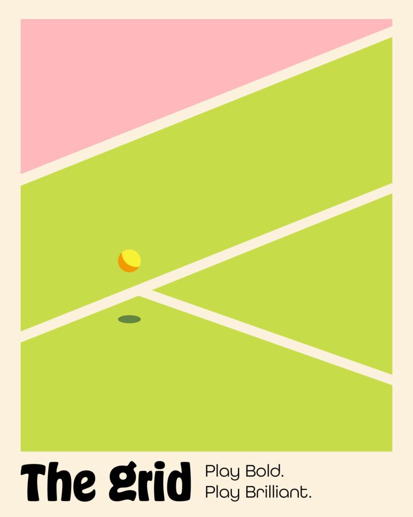
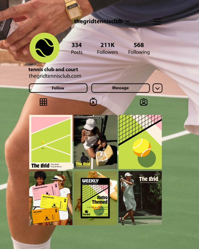
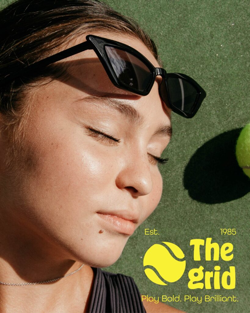
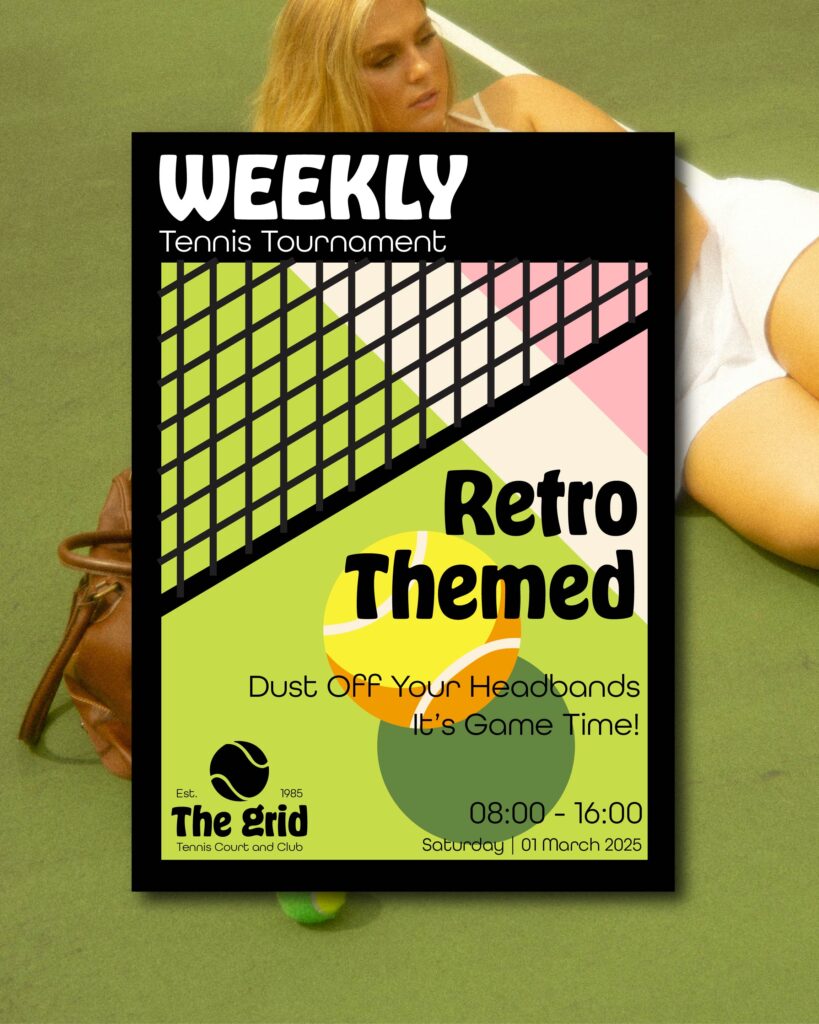
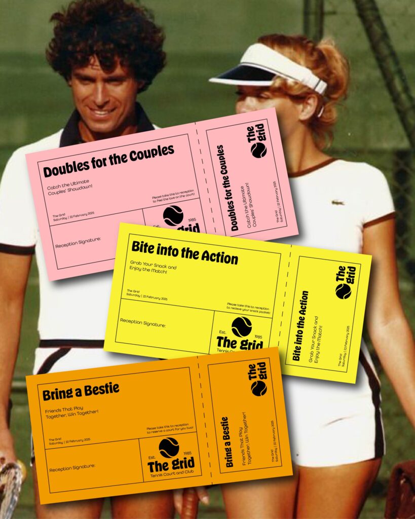
Creative Direction & Logo Design
The logo needed to act as a statement piece. Something instantly recognizable and confident.
The final direction focused on:
- A strong, bold logo that commands attention
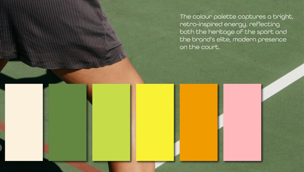
- Retro-inspired colour choices that feel playful yet premium
- Clean, simple branding that doesn’t overcomplicate the message
Every design decision was intentional. The balance between boldness and simplicity allows the brand to feel modern and timeless at the same time, while the colour palette adds warmth, personality, and approachability.
The Final Outcome
The result is a brand identity that perfectly captures what The Grid represents:
- Elite tennis without intimidation
- Luxury without formality
- Competition balanced with connection
With a statement logo, confident colour palette, and refined yet fun visual language, The Grid positions itself as a tennis club that doesn’t just host matches, it creates experiences.
Final Thoughts
The Grid proves that standing out in a crowded industry doesn’t mean shouting louder, it means being clearer about who you are.
By embracing fun, trust, and the social side of sport, The Grid has carved out a premium identity that feels fresh, bold, and memorable. A place where tennis is taken seriously. But never too seriously.
Leave a Reply