
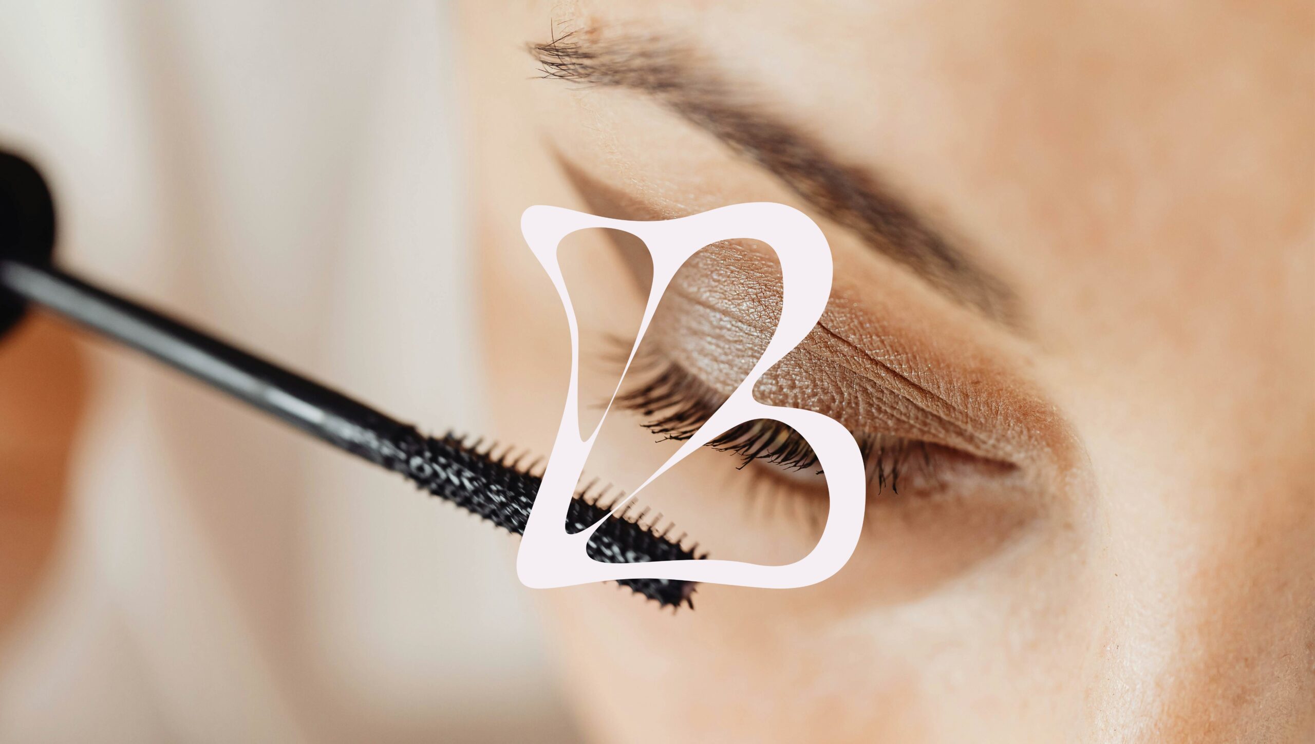
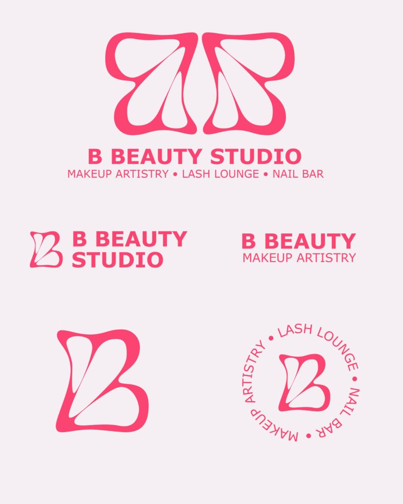
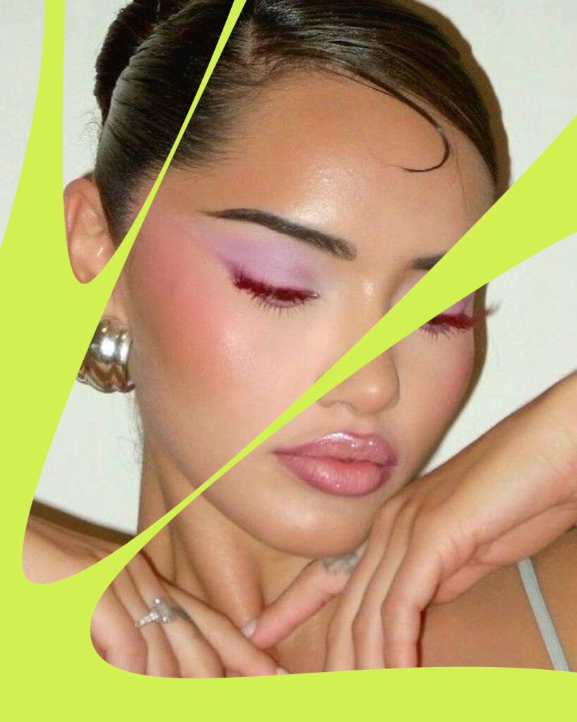
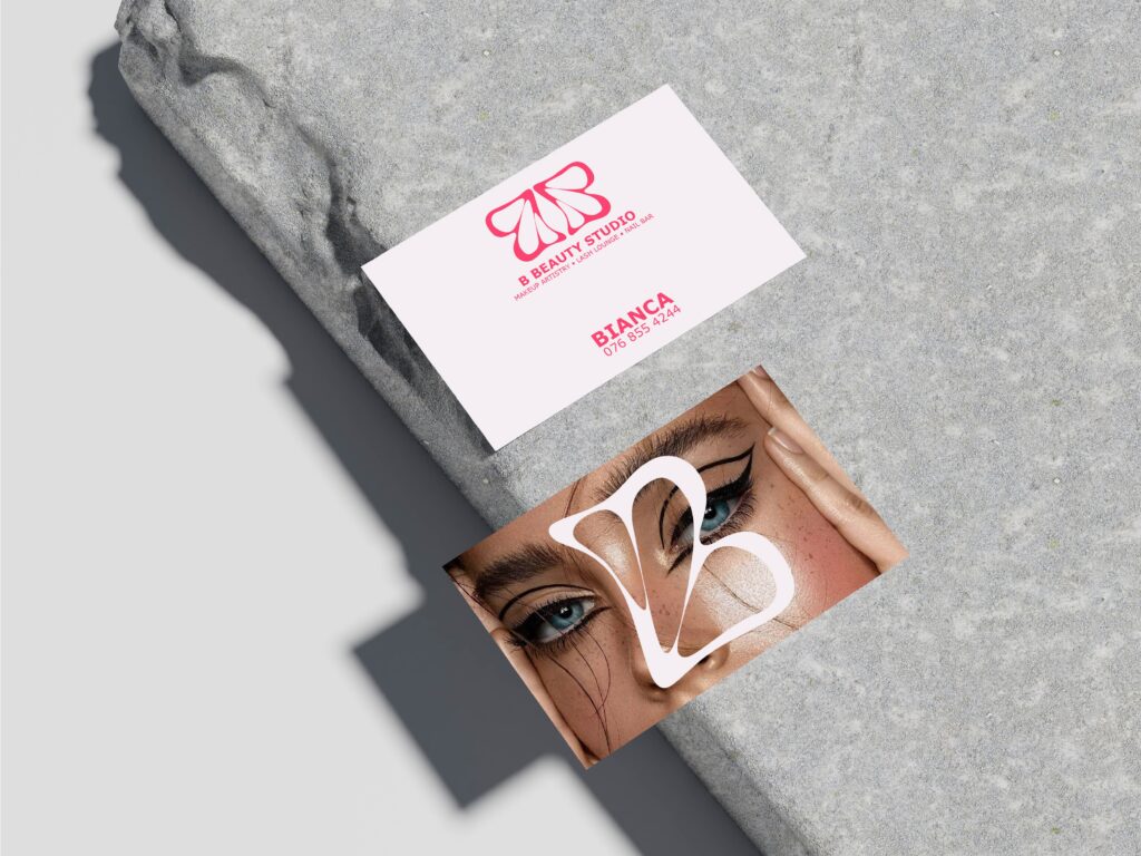
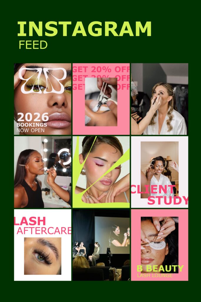
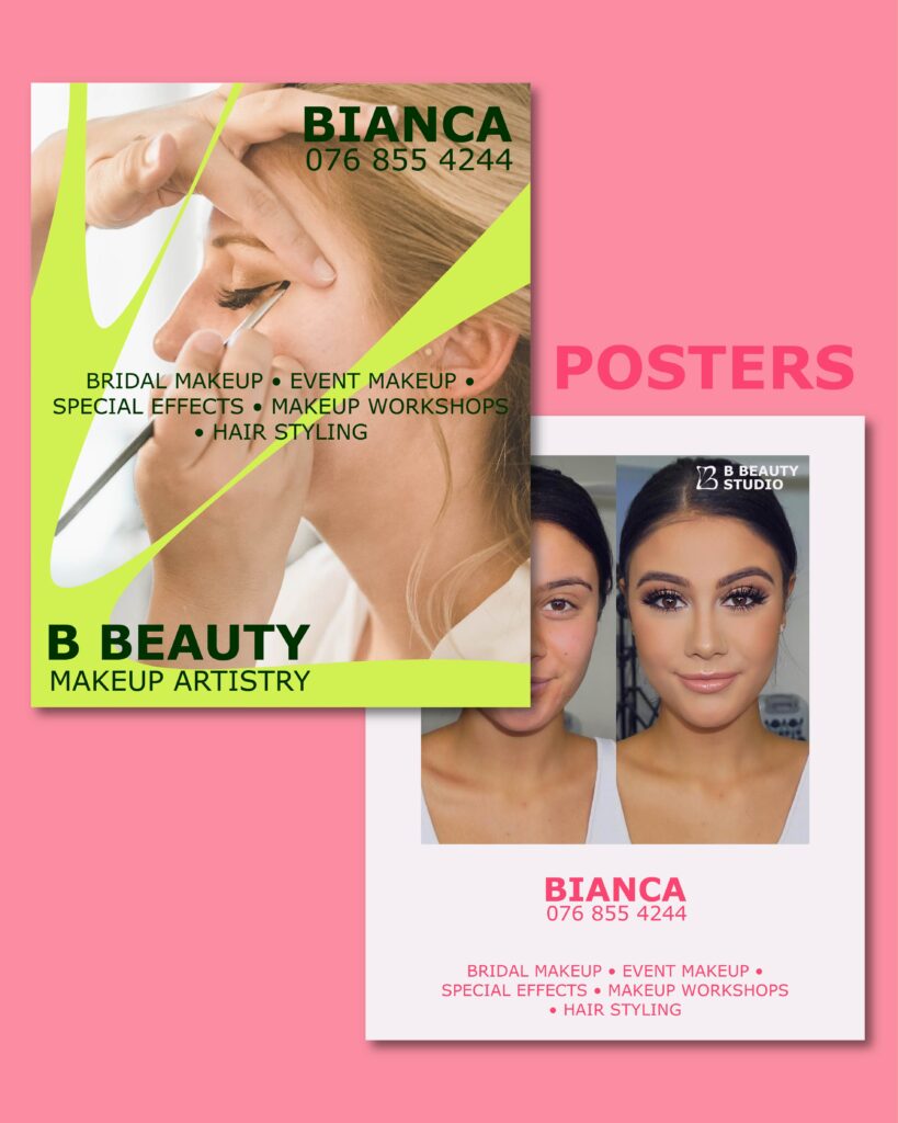
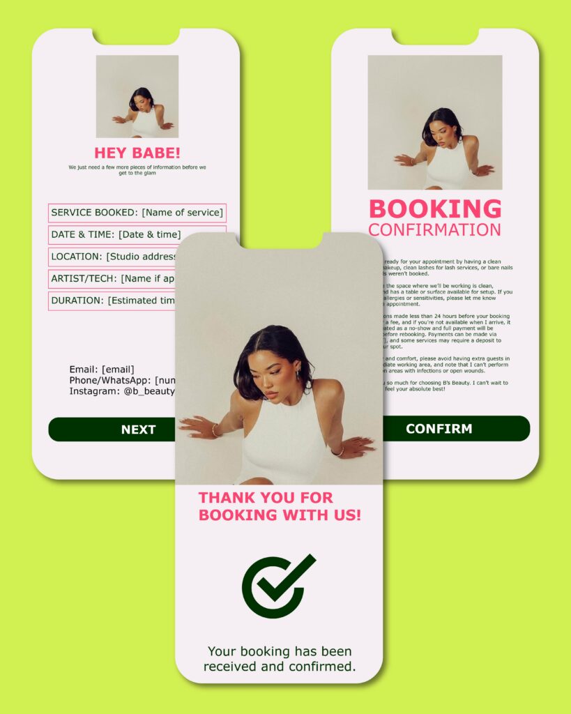
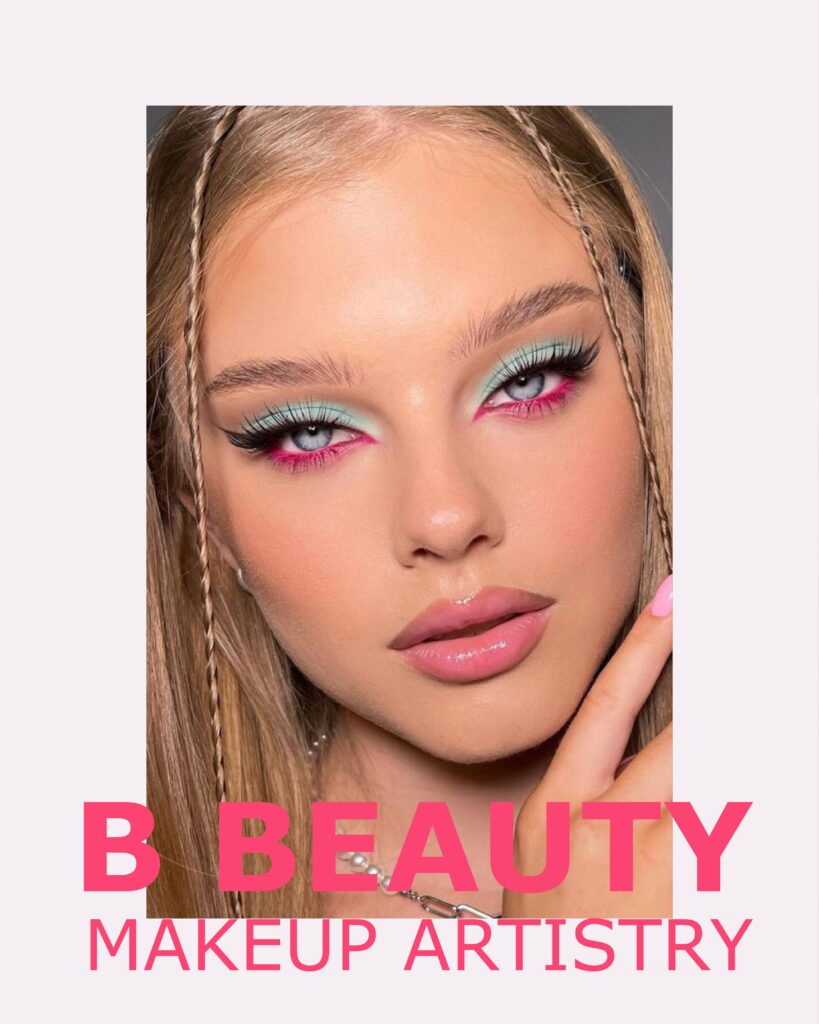
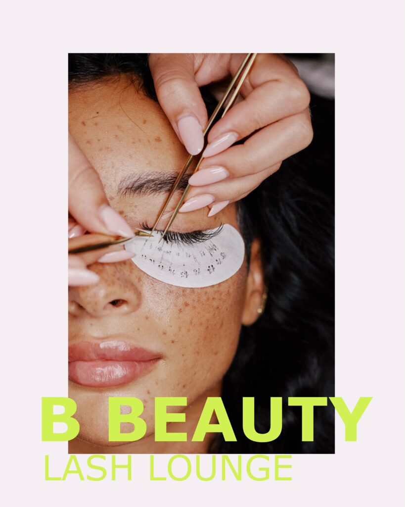
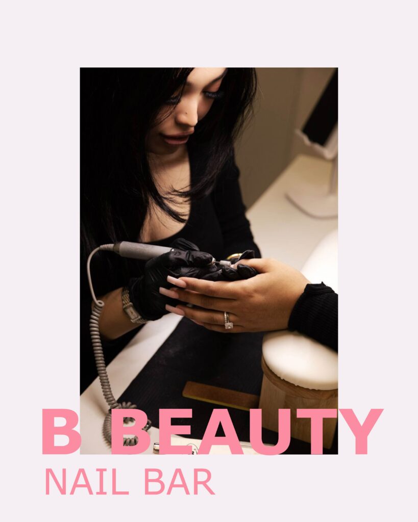
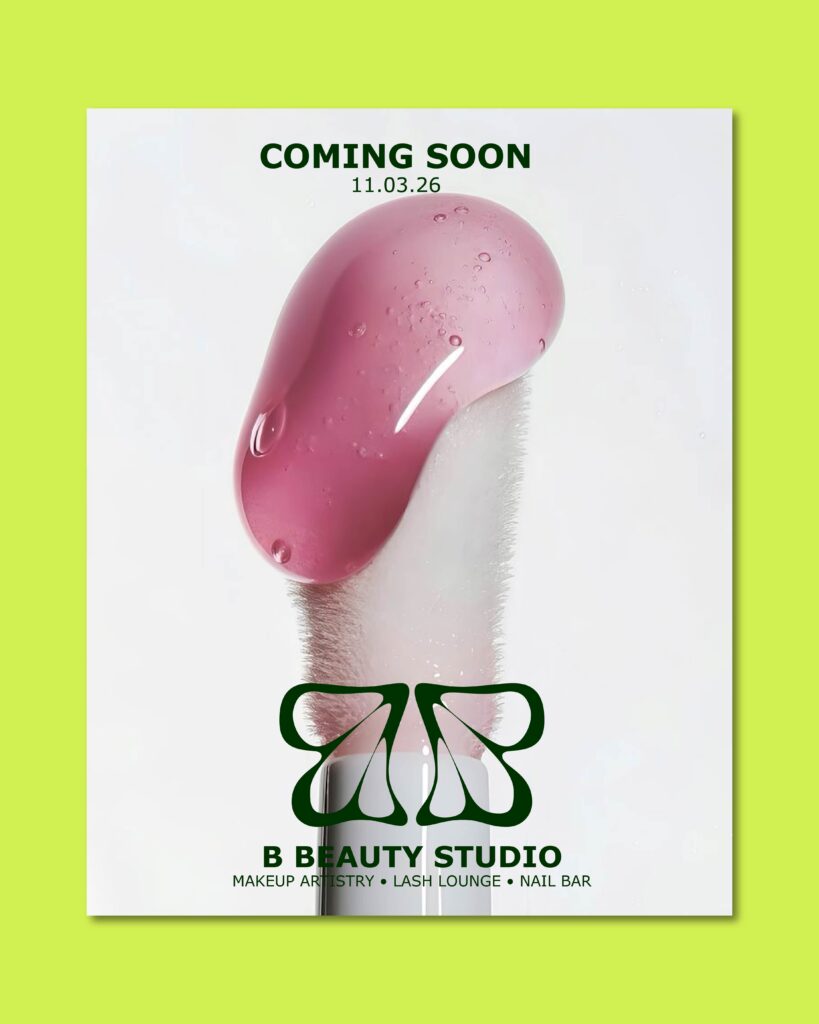
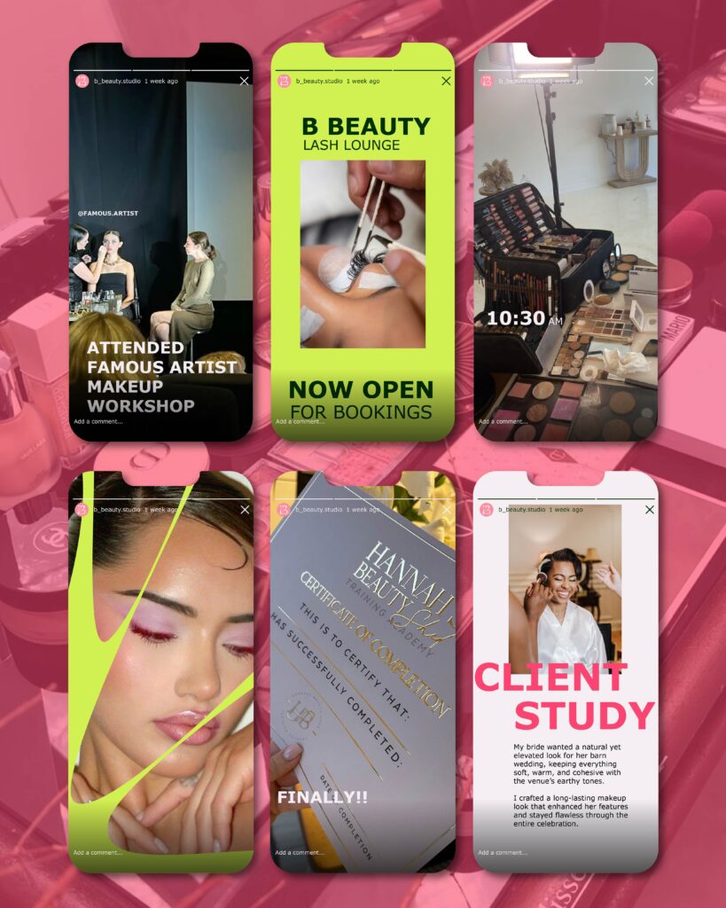
Just wrapped up the rebrand for B Beauty Studio, and I’m so proud of how this one came together. She wanted an identity that finally felt like her. Intentional, bold, and modern. I designed a visual system inspired by nature and simplicity, which works seamlessly across her client touchpoints so she can focus on what she does best without overthinking every post.
By refining her logo, colour palette, typography, and overall brand feel, the updated identity brings clarity and confidence to her business. Supporting her expansion into new services while staying true to her original vision. The transformation of B Beauty Studio already speaks for itself.
Leave a Reply